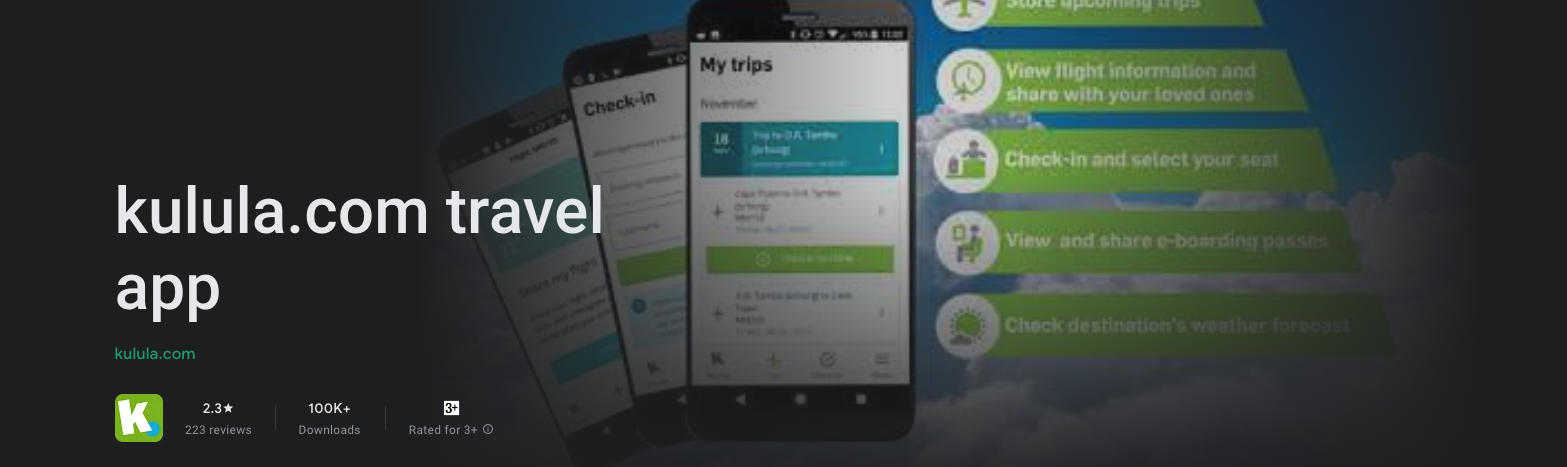
kulula
Flight travel made simpleSCROLL DOWN
A BRIEF INTRO
As one of South Africa's top low-cost airlines at the time, kulula needed to constantly evolve to meet the changing needs of the modern traveller. Traditional methods of booking and managing on web sites were still a valid method, but it was starting to make place for the more modern approach of a mobile app first solution.
THE PROBLEM, THE SOLUTION AND THE WHAT NEXT
For more than a decade kulula was one of South Africa's go-to low-cost airlines. By the start of 2018, kulula started getting behind on the ways travellers can interact and approach flying with kulula. This started a multi-year project that consisted of a new app that lives next to existing and traditional platforms.
HOW I GOT STARTED
I started conducting competitive research to gain insights into the features and solutions of our competitors.
This consisted of exploring what our direct competitors are doing, as well as exploring what direction international airlines are taking.
The competitors were identified and I conducted a heuristic evaluation of the competitor’s end-to-end user experience.
Steps like the ease of initiating and performing the main task was explored (making and managing a flight booking). From there we saw what works in making flight bookings, but also saw the
gaps in existing travel apps, for example how there was a lack of OCR technology.
From there on we could use these finding to combine it with what we wanted to achieve out of the app and started writing all the ideas out
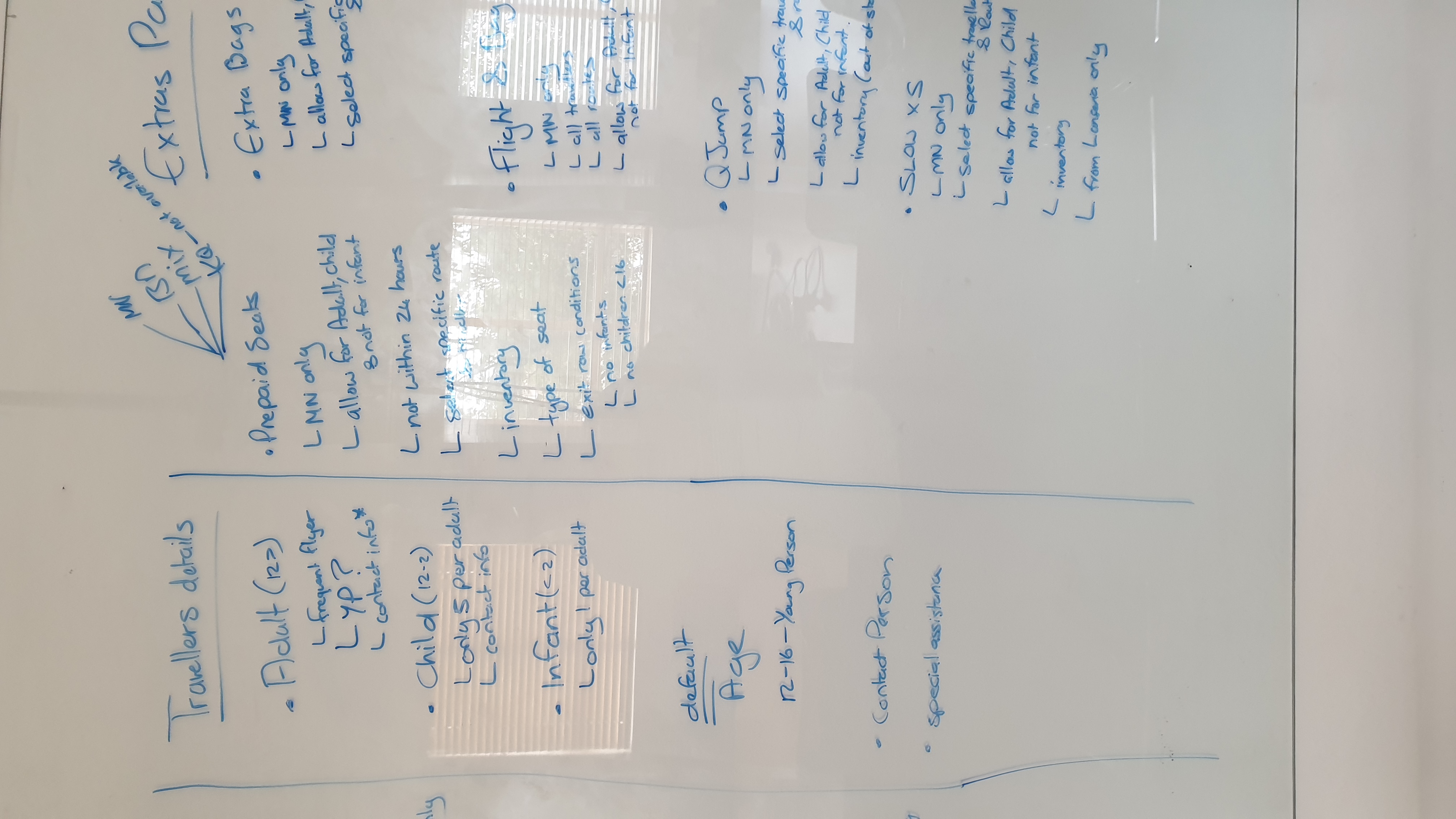
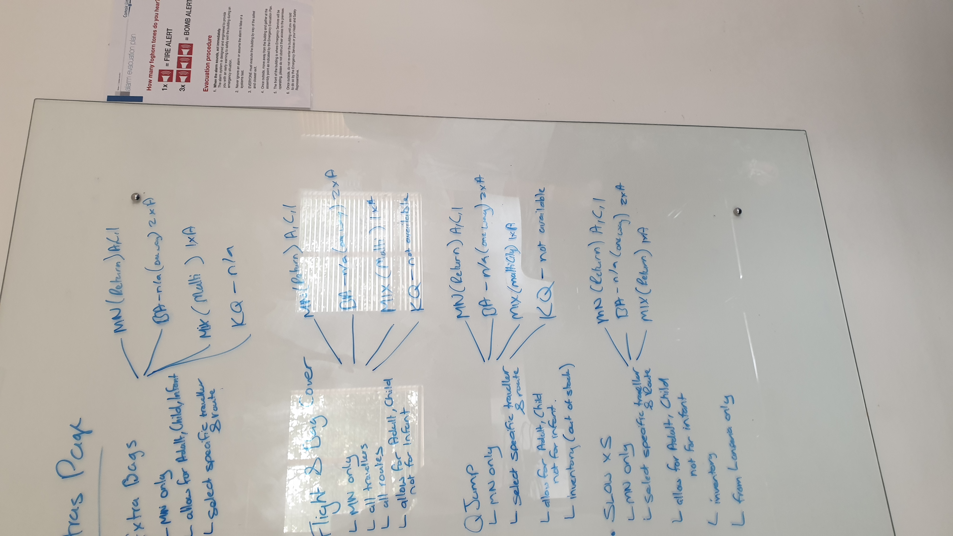
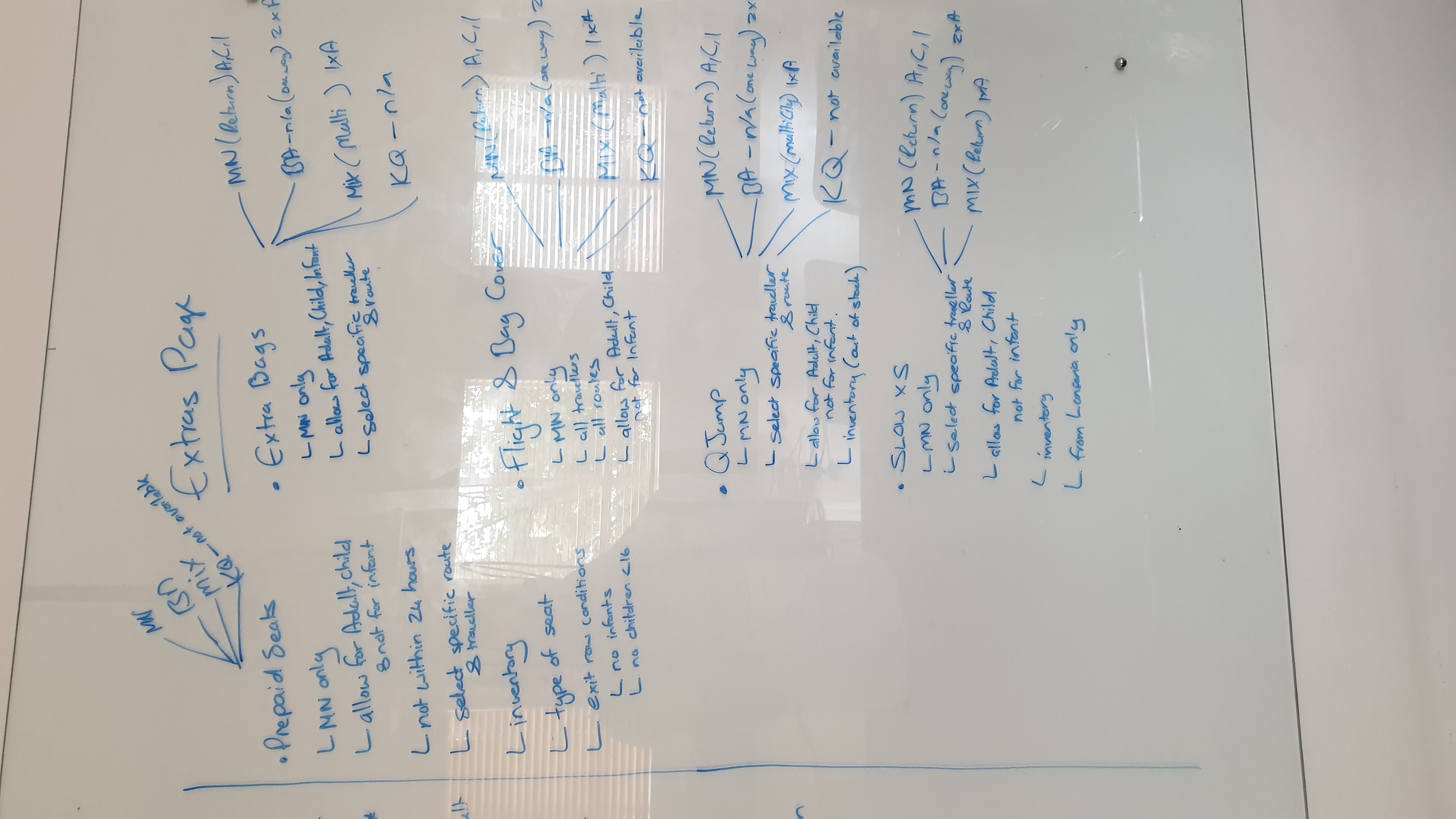
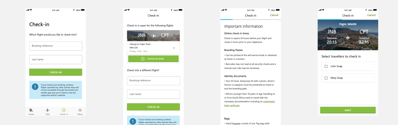
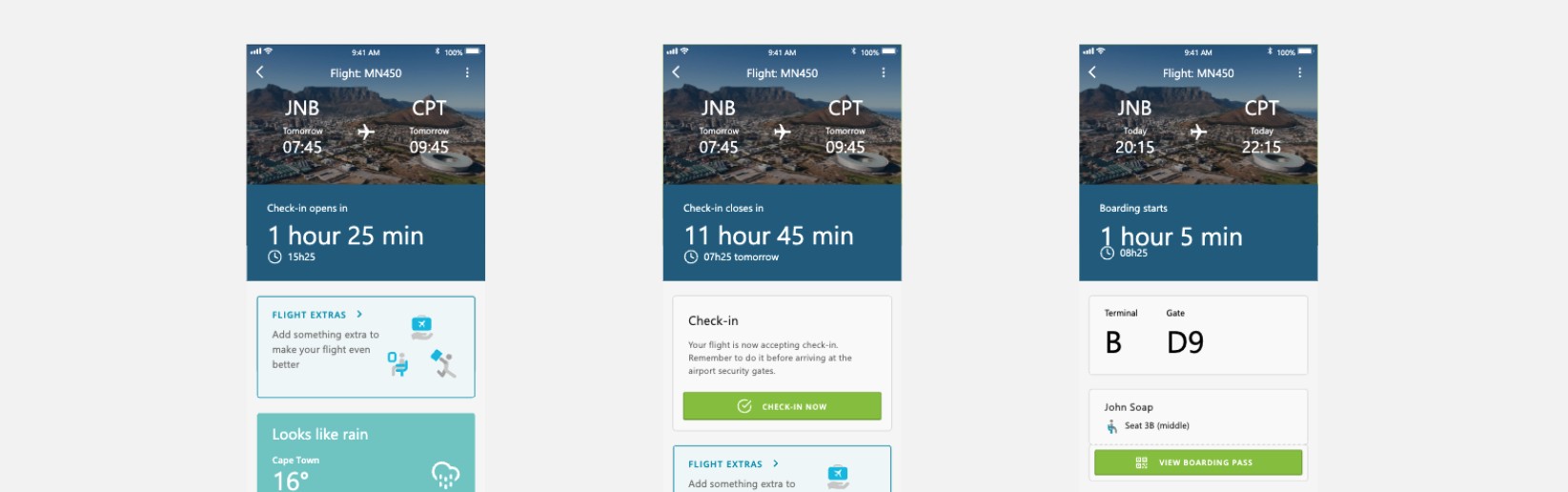
THE DESIGN PART
Using Adobe XD, I created low-fidelity wireframes. I then improved them by adding copy provided by the marketing team and Ops team. At this stage, the wireframes were defined enough for some user testing, which was tested on internal and external users. Based on feedback, I’ve made a few alterations and moved on to creating high-fidelity mockups.
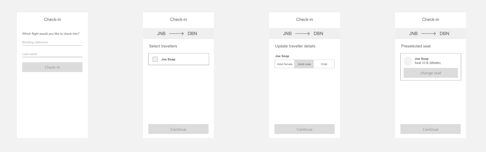
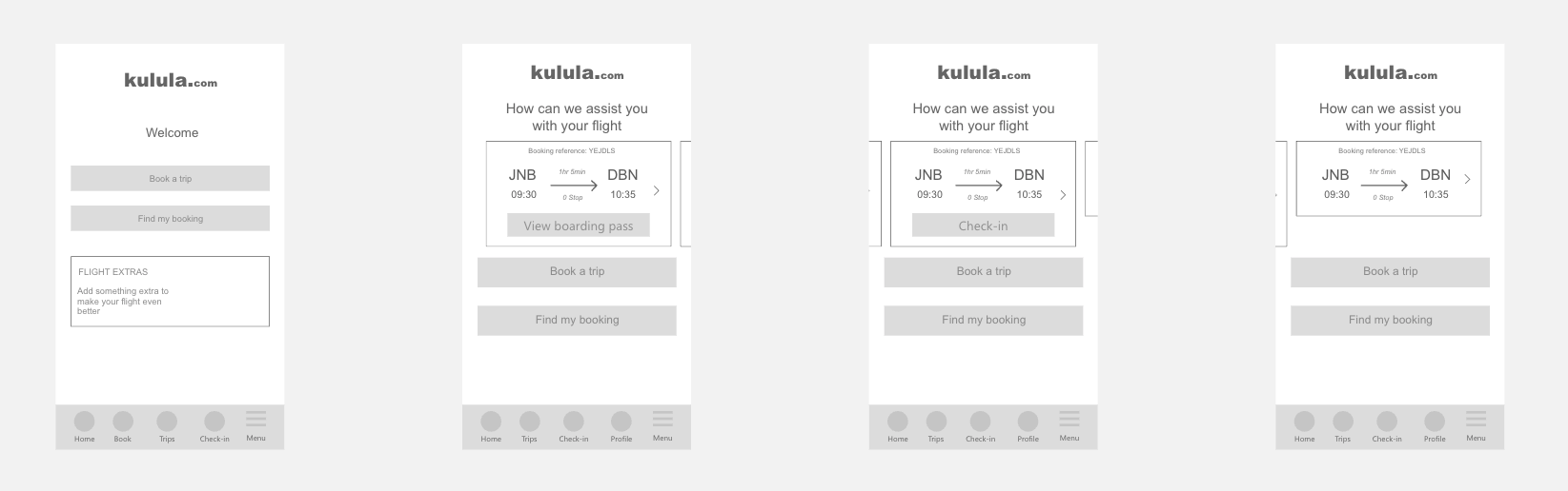
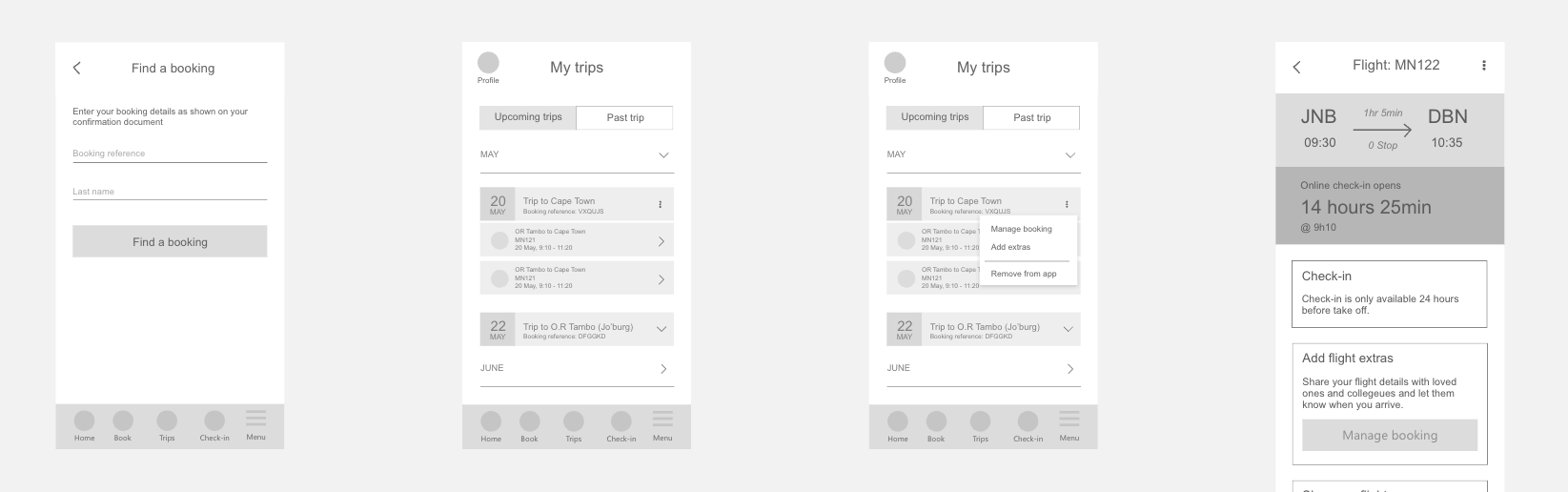
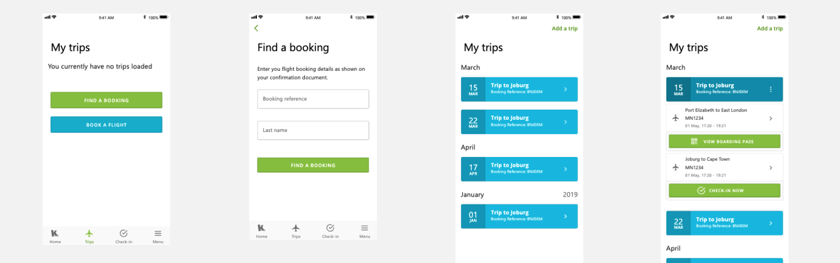
Once the raised issues were resolved, I moved on to design the final screens in XD. A primary goal for us and the company was to create a visual identity that’s aligned with the brand’s values and message. This is where all previous research and planning came together.
CONCLUSION
Unfortunetly most of the app did not go to production, but it did give a starting point for kulula to provide their clients with a mobile app. Also working with multiple experienced designers was a great experience, as the app was so large with different sections, that certain sections needed to be split up. The partial app launch however also had some negative consequences, as end-users expected a full fledge app from the very beginning. A lesson learned is that not all the correct questions was asked with the initial interviews, and that assumptions is not always the best practice as this leads to not knowing how the users will react with a different sort of release.
.png)
Danie Fourie | Copyright © 2024 | Proud South African